Reducing Autodesk Licensing Costs By 30%
Autodesk has undergone numerous modifications to its licensing models over the years, leading to increased costs for customers. However, there are now three new developments that make it easier to reduce licensing costs, especially for those who previously used Network licenses. These developments are:
- The elimination of FlexLM Network Licensing
- The introduction of a new, consumption-based Flex Licensing
- The integration of analytics into the Account Management Portal
By leveraging these changes, it is now possible to reduce licensing costs in a more cost-effective manner. Let’s take a closer look at each of these developments and understand the opportunities they provide. Numerous customers have reported savings of up to 30% on their renewals by implementing these concepts.
1) FlexLM Elimination
Autodesk made changes to its licensing model with the elimination of FlexLM Network licensing, offering a 2-for-1 trade-in of existing network seats to named user licenses. This resulted in reduced visibility on individual software usage and, in some cases, caused customers to become over-licensed. The absence of clear usage information prompted customers to purchase additional seats at full cost as they expanded their staff, leading to the likelihood of customers with large pools of network licenses having more licenses than necessary.
2) Rollout of ‘Flex’ Token Consumption Licenses
Autodesk introduced Flex licensing as a replacement for FlexLM. With this model, you buy a volume of tokens. Each product has a set token cost. Usage consumes tokens per day per user per product. The same person can use different versions of the same product or a different computer without consuming additional tokens. Only using a different product or on a different day will result in additional token consumption. No cost is incurred if the product is not used. This licensing model is more cost-effective than full-cost assigned licenses for part-time users, although less flexible than previous network licensing.
3) Usage Analytics
Autodesk recently made license usage analytics available to all customers, not just those with Premium Support. These analytics let you monitor how your Autodesk licenses are being used among your users. Although they may not have the same level of data accuracy as FlexLM, they still provide valuable information to help you determine if the Flex Licensing model is more cost-effective for a user compared to a dedicated named user license.
Analyzing Your Usage To Achieve Savings
Autodesk offers tools to calculate the number of Flex Token needed and understand token consumption rates. Check out the resource pages at https://www.autodesk.com/benefits/flex/estimator-tool and https://www.autodesk.com/benefits/flex/flex-rate-sheet.
However, to effectively compare costs with named license products, you need to consider the usage mix of products in a Collection. The Autodesk Management Portal’s Usage Reporting displays product usage but can be difficult to understand with a mix of products used by the same user. Some resellers offer PowerBI reports but still face the same challenge.
A better approach is to examine past usage and assign a theoretical cost under Flex licensing. You can easily compare this number to a named user license to determine what’s best for a given user.
I’ll share a simplified process. Those with basic Excel knowledge should be able to perform the analysis. For more detailed instructions and an opportunity to learn something new, I’ll also provide a step-by-step guide using Excel’s Power Query feature. There are various methods to gather the data, but many Excel users are unfamiliar with Power Query. I suggest giving it a try, as it quickly streamlines data collection with a short learning curve. Plus, using Power Query, you can easily update source data for instant updates.
Analysis Steps – High Level
To perform an analysis, here are the high-level steps to follow:
- Get a Usage report from Autodesk’s Management portal, selecting the option that reports daily usage for users over the entire last year.
- Open the report in Excel, remove unwanted columns and keep only the user’s name/email, product, date of usage.
- In another tab, create a Rate Sheet using the data from Autodesk’s website, including the product, number of tokens and daily cost.
- In the Rate Sheet tab, search and replace extra data in the daily cost column to leave only the dollar amount.
- In the Usage tab, add two columns for the number of tokens and cost.
- Use VLOOKUP to find the product in the Rate Sheet and import the related data into these columns.
- Create a Pivot table and adjust the data fields to display total cost for each user.
- Compare the “theoretical” Flex cost with the cost of a full license for easy evaluation.
That’s it. You can ow see which users are “Cheaper” under Flex than the cost of a dedicated named license.
Analysis Step – Detailed w/Excel Power Query
If you want to learn Excel’s PowerQuery or have a more detailed explanation, this section is for you…
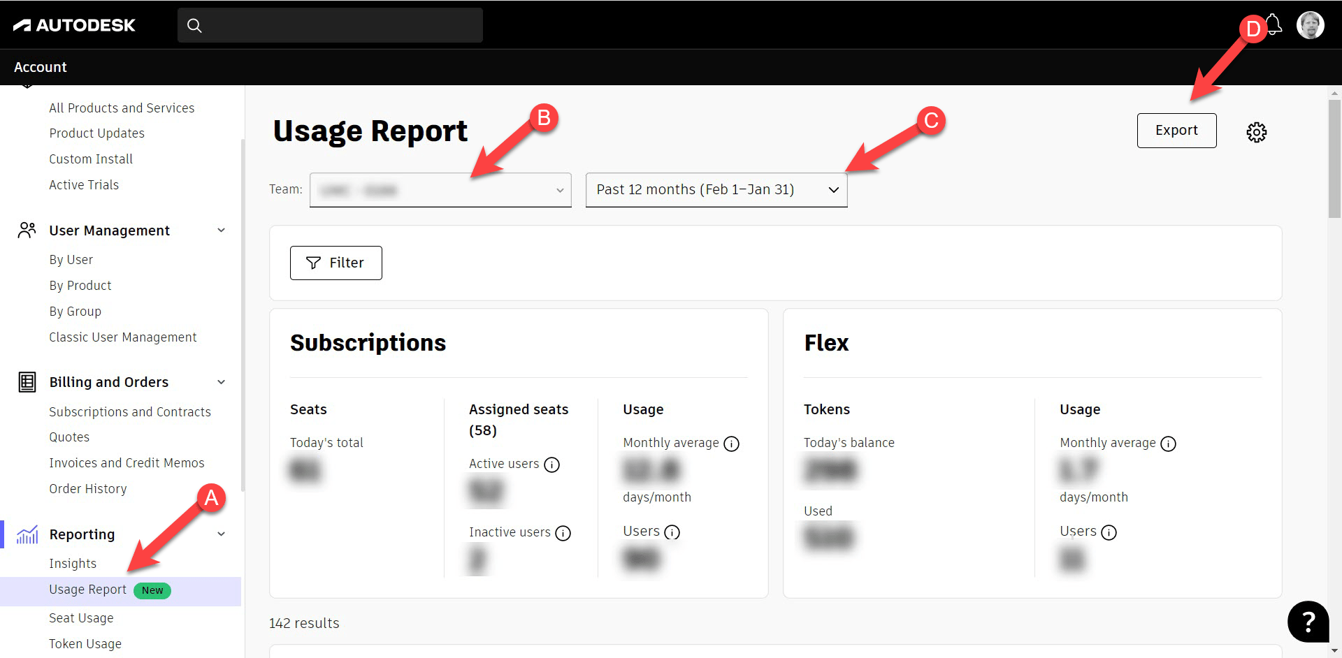
Step 1
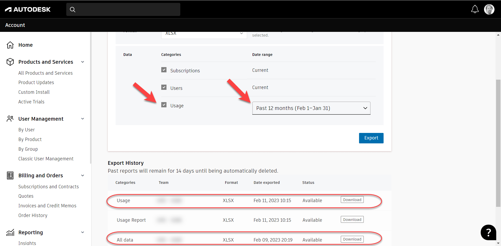
Go to your Autodesk Account Management portal. https://manage.autodesk.com Here you’ll see Usage Reporting (A) if you’re an Account Admin. You’ll want to change the duration for the full year (C) and make sure you’re looking at the correct Team (B). This then displays high level stats and more detailed drill down information further below. Click the Export button (D) to export usage data.
Step 2
When you get to the Export page, you’ll see there’s a report being generated automatically. This is the with “Usage Report” in the category. You do NOT want this report. This is a summary report. Instead, you’ll want to use the options at the top of the page and generate a ‘Usage’ report. If you select all options, you’re report will say “All” although for this purpose, those other data points aren’t needed.
Download this report when it’s finished generating.
Note, you can get to this Export page from the “By Product” section too.
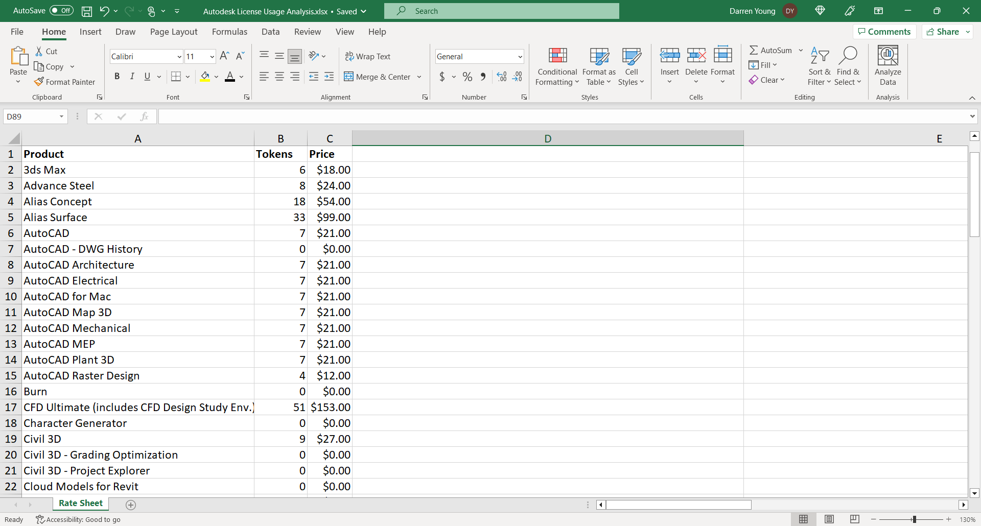
Step 3
Start Excel and create a new Spreadsheet in the same place you downloaded your usage report. In the new spreadsheet, create a Token Rate sheet consisting of the product name, number of tokens and daily cost. You can copy and paste this from Autodesk’s site linked earlier. Clean up the data and rename the spreadsheet tab something meaningful. When you’re done, it should look something like this.
Step 4
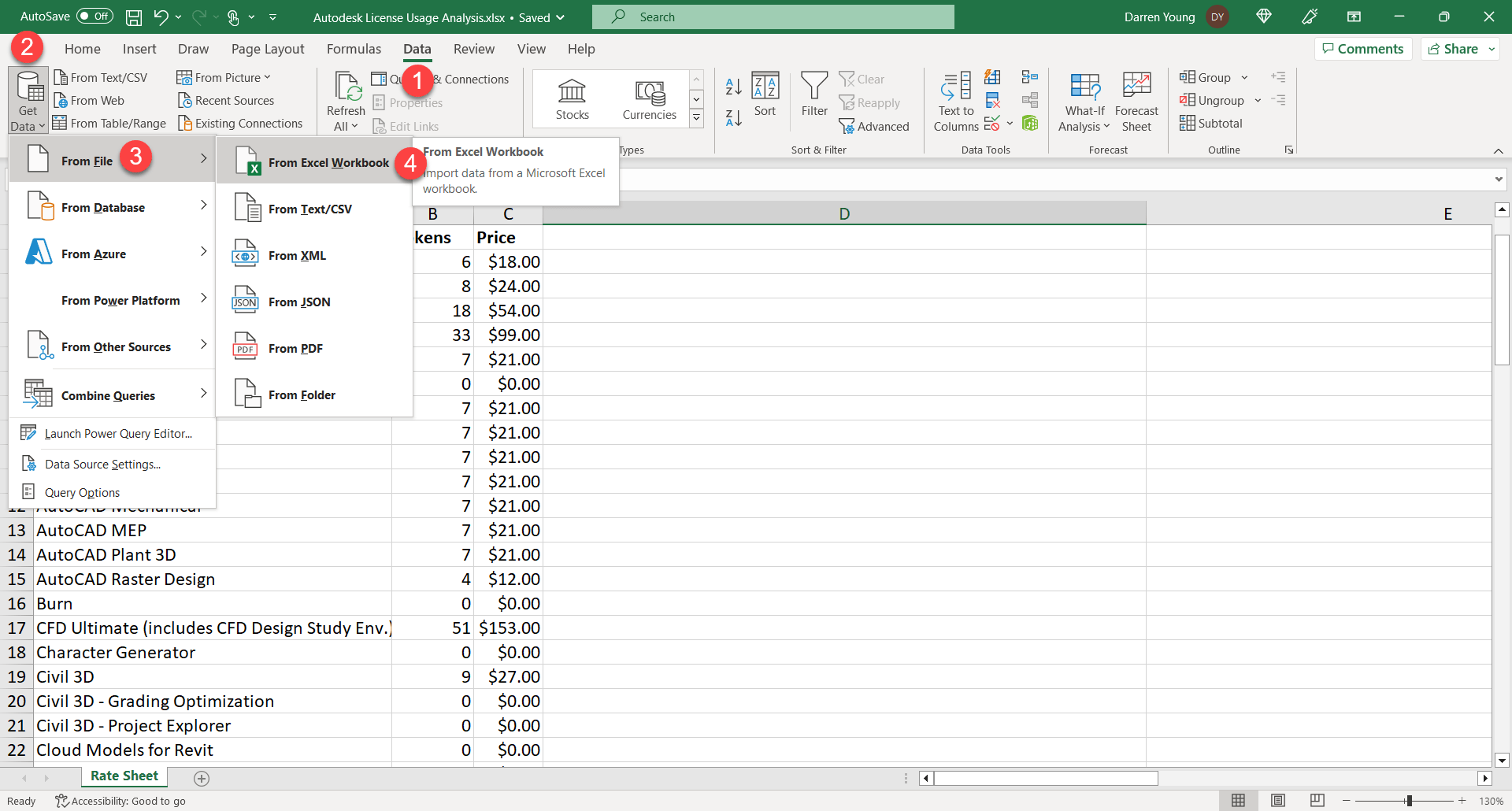
Now we’re going to use Excel’s Power Query functionality to merge in our exported data. The benefit of doing it this way is that you can replace your export later with new data and not have to do all these steps. It’s merely referenced into the Spreadsheet you’re working in. Select Data (1), Get Data (2), From File (3) then From Excel Workbook (4).
Step 5
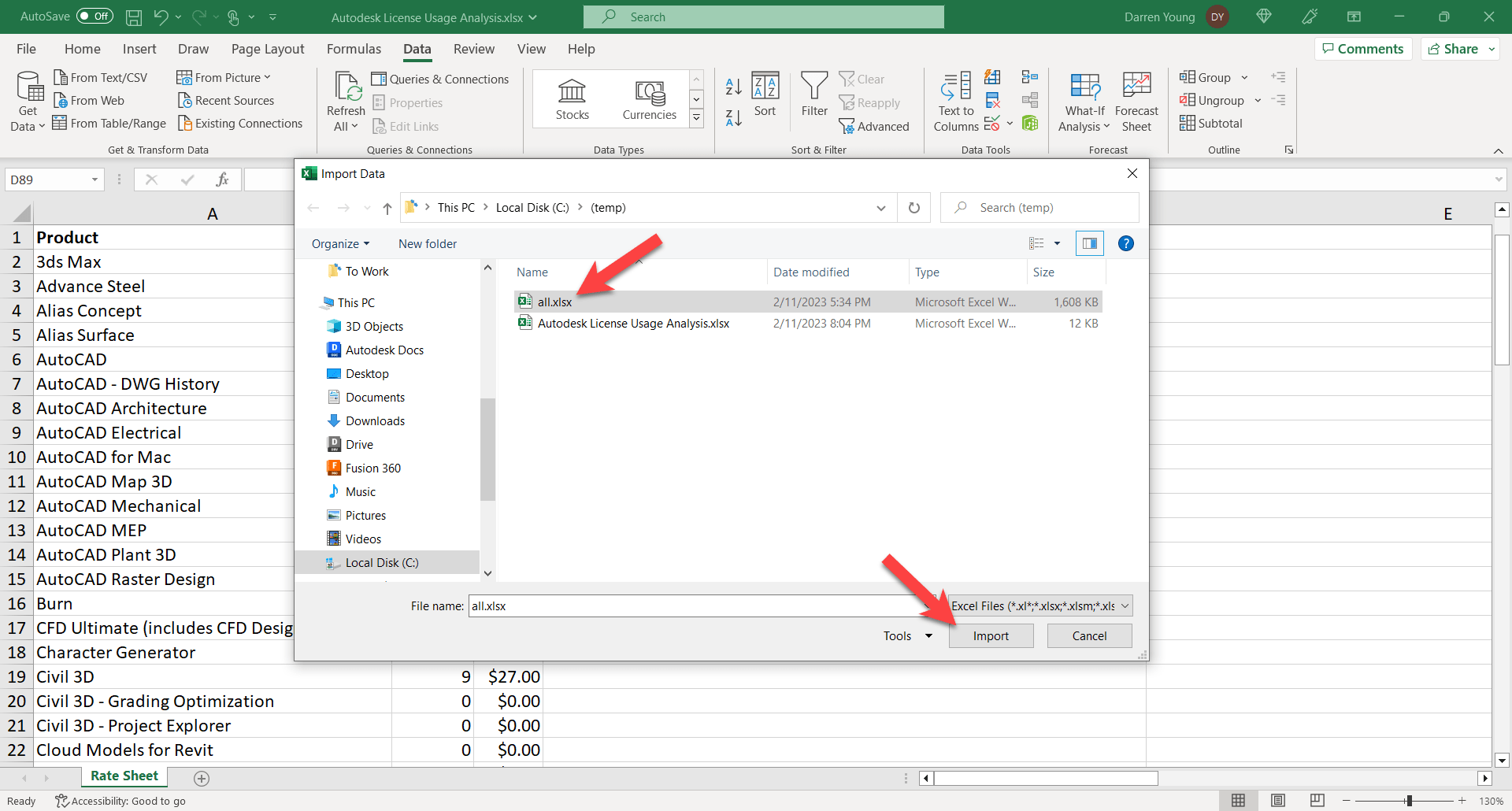
Select your usage report that you downloaded from Autodesk (1) then click Import.
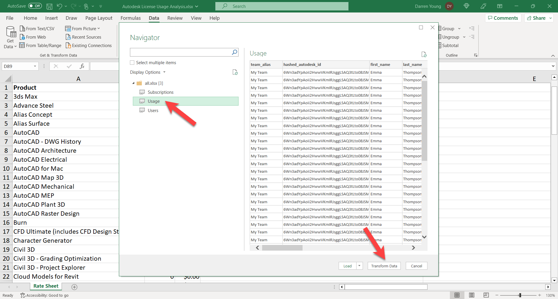
Step 6
Next, Excel will examine your spreadsheet for data sources. Select the “Usage” Tab (not Users) and click “Transform Data“.
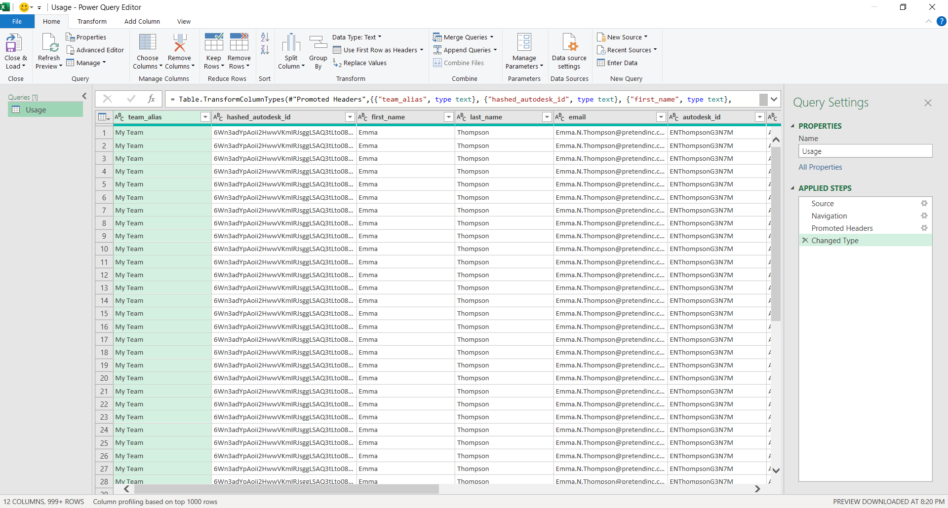
Step 7
This brings up the Power Query Editor. Here’s where Power Query makes it very easy to clean and scrub your data step by step so you don’t have to alter the source data. This means you an update your source data anytime, and Power Query will perform the same cleaning steps.
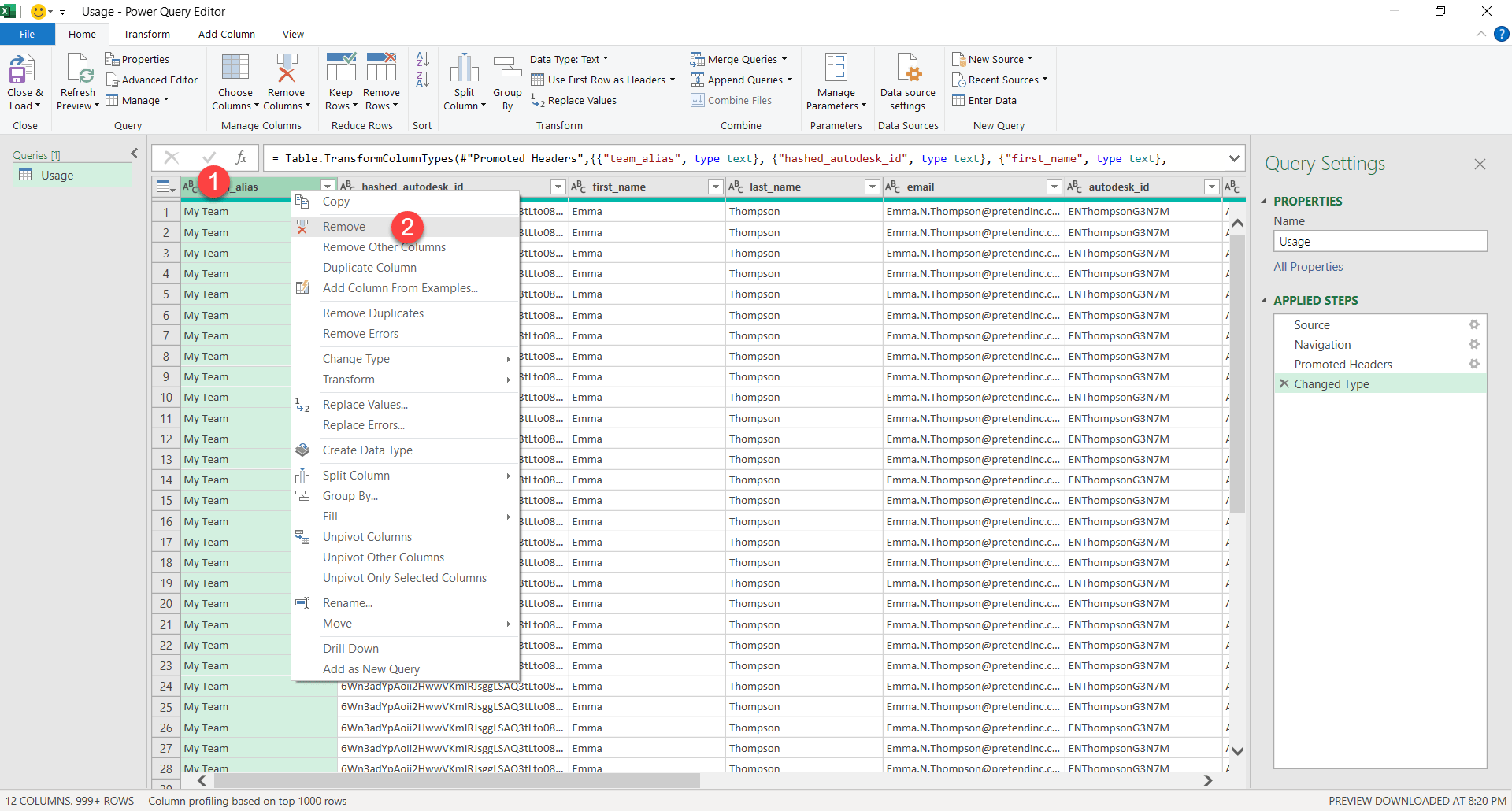
Step 8
Next, we’ll start removing columns we don’t want. Right-Click on the header of the first column and select Remove to remove that column. You’ll notice on the list of steps on the right, there’s another entry added.
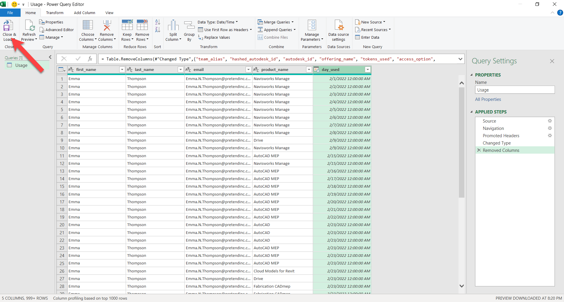
Step 9
When your done, you should have only the following columns remaining…“first_name”, “last_name”, “email”, “product_name” and “day_used”. We could go further, but for now, let’s see what this looks like. Click Close & Load to import this cleaned up data into your Excel Spreadsheet.
Step 10
Excel closes the Power Query editor and loads your cleaned up data into your spreadsheet. It’s not actually “in” your spreadsheet, it’s referenced from the usage report you downloaded from Autodesk and Power Query cleaned and filtered it before displaying it. You could replace the usage report 2 months later with newer data and this spreadsheet can then be refreshed to show you the latest information.
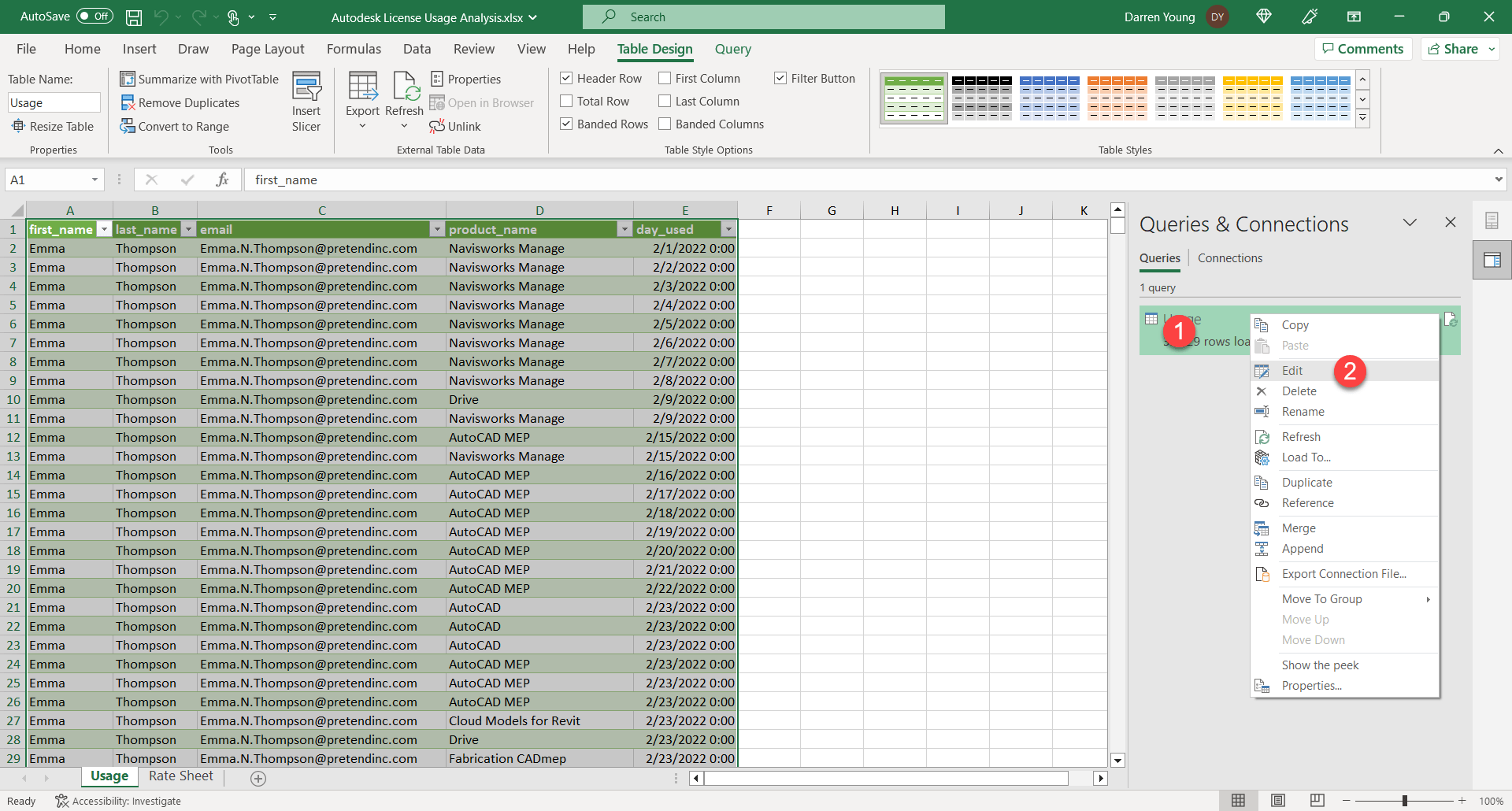
Next, we’ll add a few more columns. To get back to the Power Query Editor, Right-Click on the Connection in the palette on the right and select Edit.
Step 11
The first column we’re going to add is one that concatenates the “first_name”, “last_name” and “email” fields together. This isn’t really needed, but I like to see both the name and email. This will help combine them in the Pivot table we create later. The name is helpful to know who the user is, but Autodesk accounts done times it’s easier to use the email. That’s why I use both. Especially if your company’s email format only includes the first letter of a name.
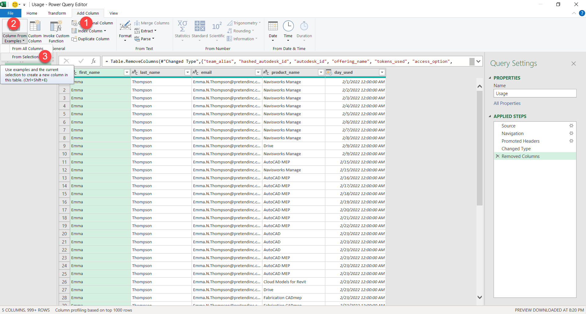
To start this process, select Add Column, Column From Examples then From Selection.
Step 12
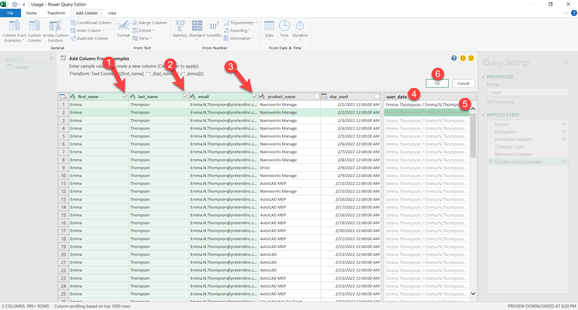
In this step, select the columns you want to combine. Here it’s “first_name” (1), “last_name” (2) and “email” (3). This tells Power Query which columns you’re going to pull from. Next, Double-Click on the header of the new column on the right (4) and edit the column’s name to “user_data”. Next, Double-Click the first open cell below that header (5) and start typing an example of how you want the data to look. Here, I type “Emma Thompson / Emma.N.Thompson@pretendinc.com”. Power Query is looking at the columns I selected earlier and the example text I typed to determine which fields to combine along with any extra data like the space or slash I’m using for formatting. Next, press Control-Enter to fill the examples in the rest of the cells. Once complete, click Ok (6) to insert the new column.
Step 13
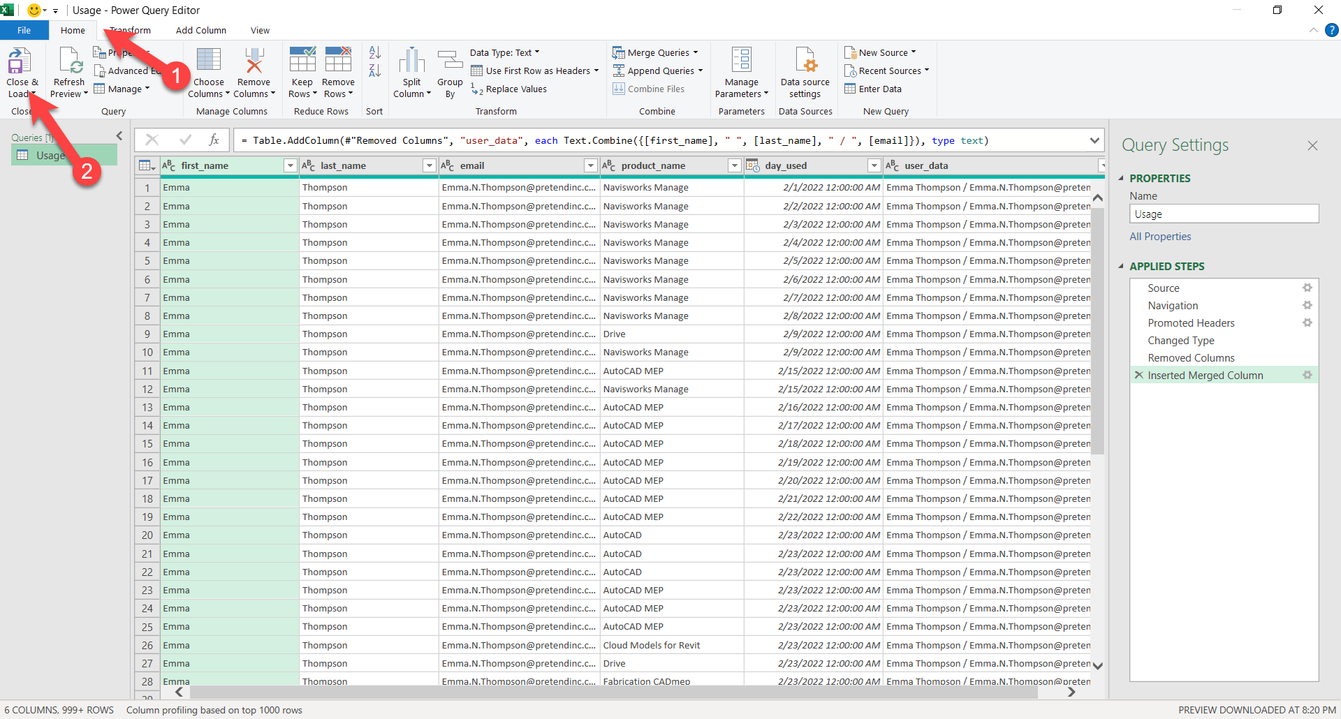
You’ll see the column added to the Power Query Editor. Next, let’s load that back into Excel. Click Home then Close and Load to load this query into Excel.
Step 14
Now that you’re back in Excel, you can see the data column that was added. Your source data however is not altered. Next, we’ll need to create another query for our Rate Sheet tab. This is just raw data. It’s not intelligent so we’ll make a query of it to give us more power.
To do this, we’ll make it a Table so Power Query can more intelligently pull data from it. Select the Rate Sheet tab (1) in your spreadsheet. Next, Click Insert (2) then Table (3). Excel should find all the data in the sheet and automatically enter the range into the popup dialog when you can click OK,
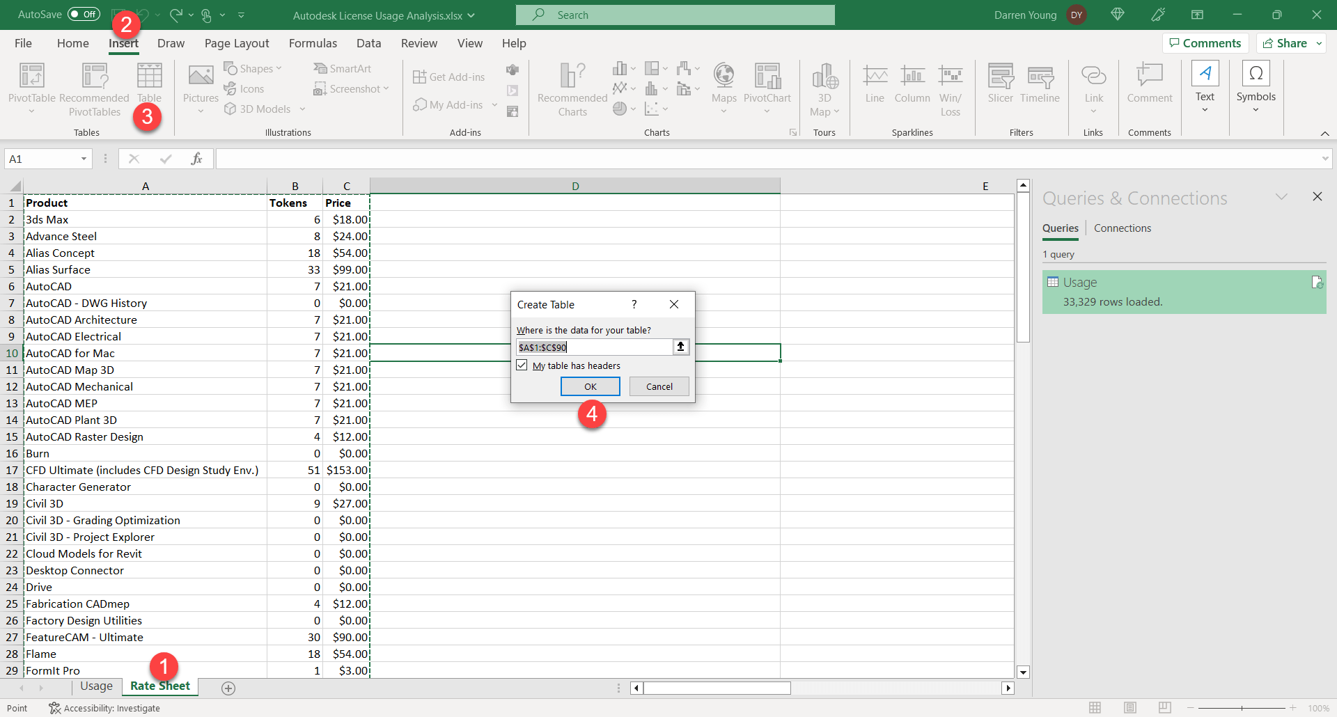
Step 15
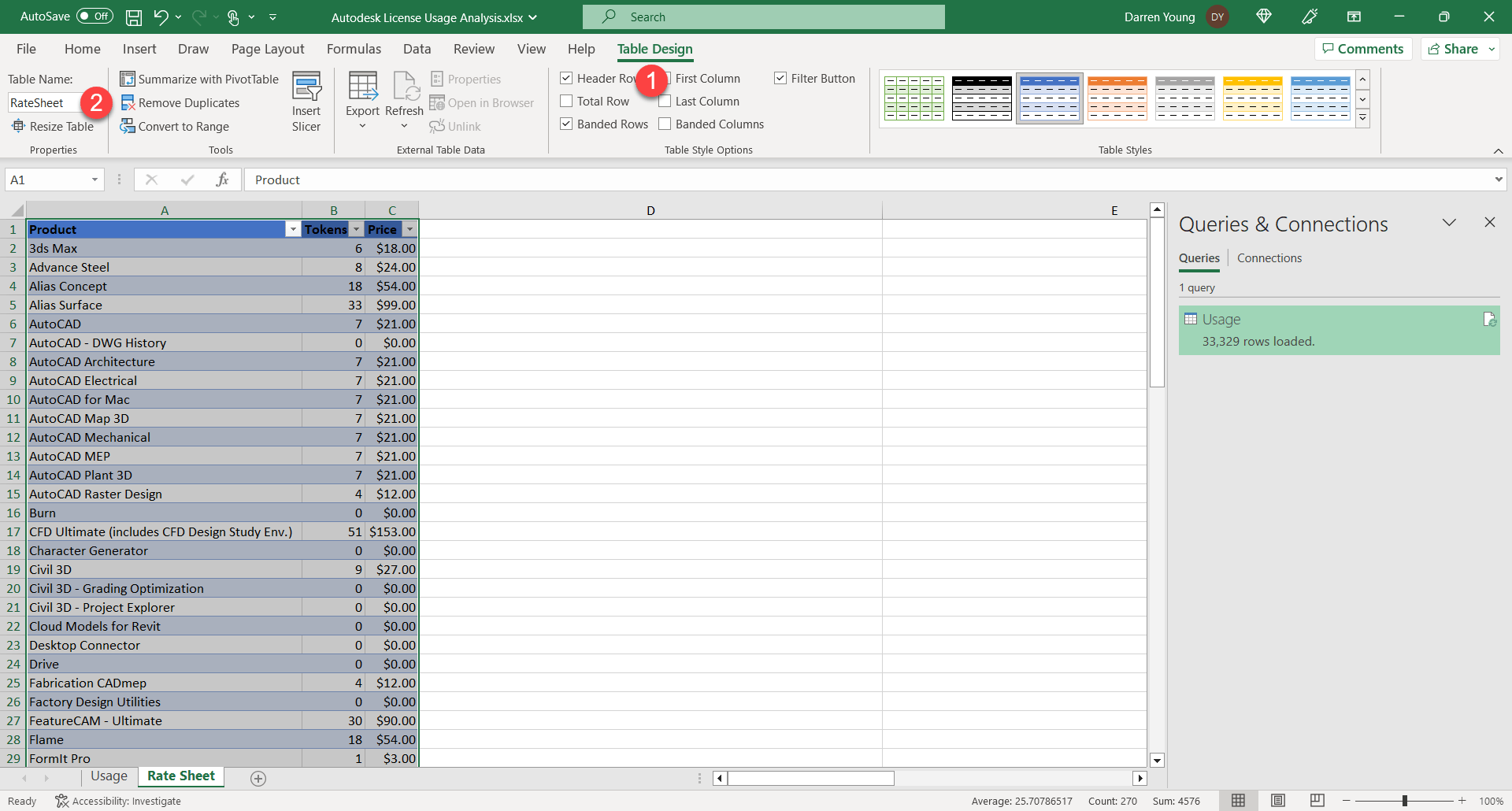
Excel turns your data into a Table which is a more intelligent object. From here, we’ll rename the table to something more intuitive. Click Table Design (1) then in the Table Name edit box, type “RateSheet”.
Step 16
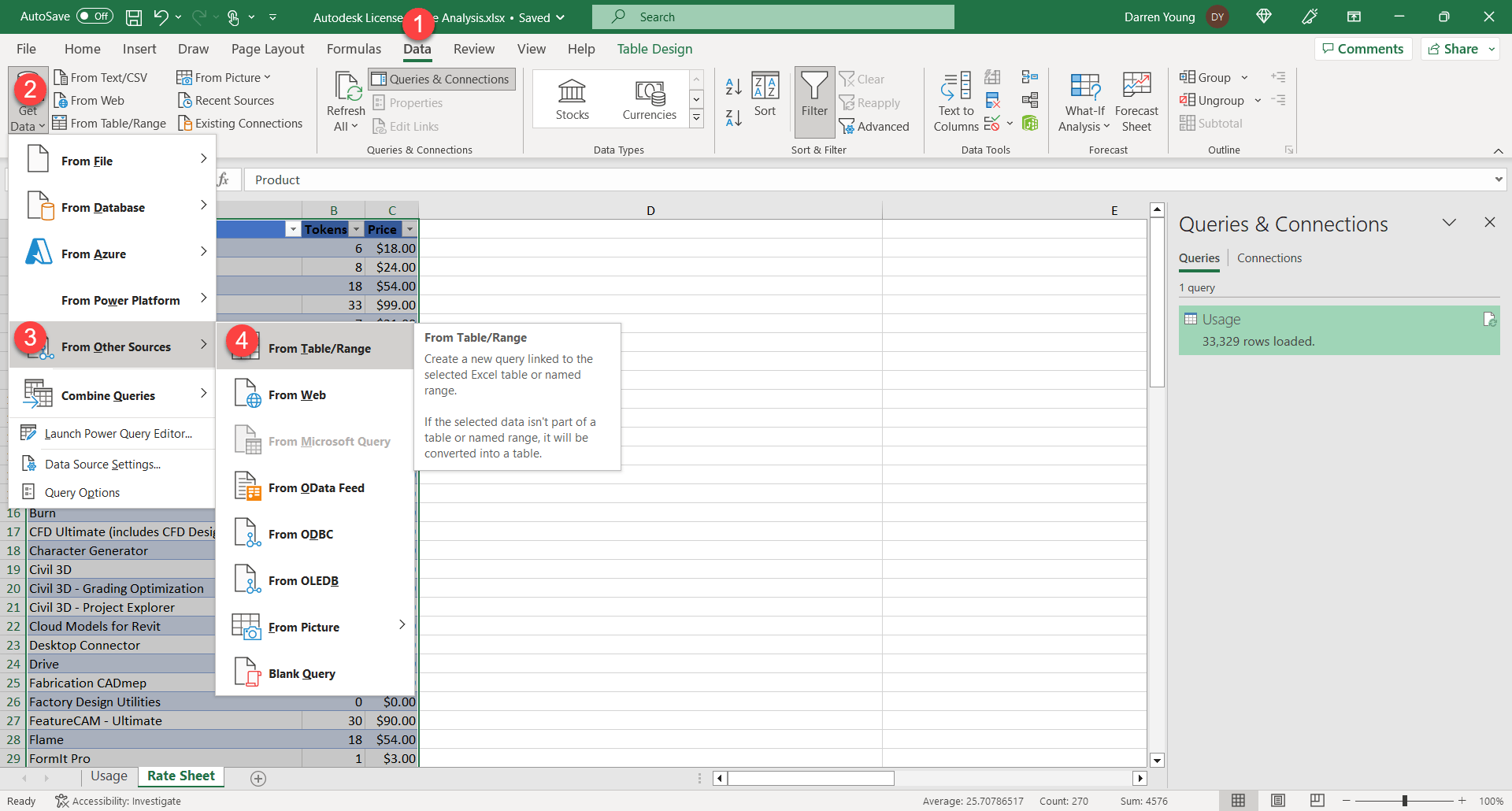
Next, let’s make a new query of this table. Select Data (1), Get Data (2), From Other Sources (3) then From Table/Range.
Step 17
You’ll see Power Query brings in this table into the editor. Notice on the left in the Query palette the name RateSheet. This was a result of renaming the Table earlier otherwise you would have had a generic name that wasn’t as intuitive. You can rename Tables later but Power Query doesn’t see those renames and it’ll break your query.
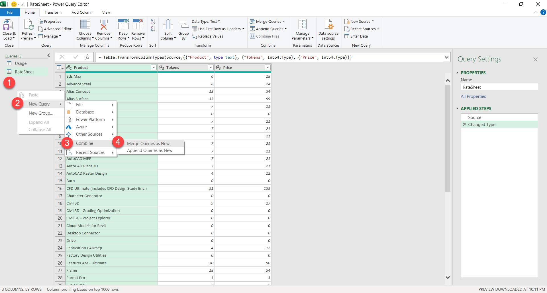
We really don’t need to do anything with this query on the RateSheet. It’s there really for the next step where we merge those two queries together. Right-Click (1) on an open area of the Query palette. Select New Query (2), Combine (3) then Merge Queries as New (4).
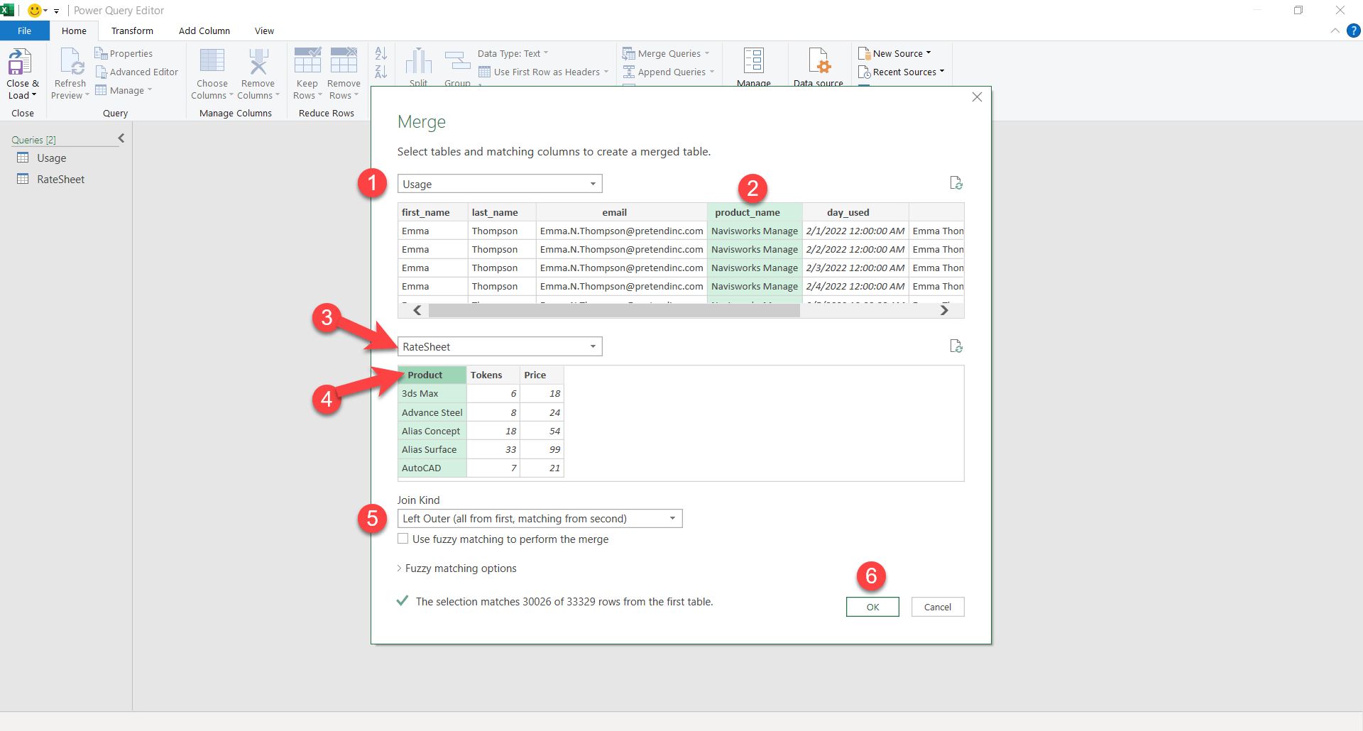
Step 18
From the merge dialog, select Usage (1) in the first dropdown list. Next, select the product_name (2) column. This is the data we’re going to use to lookup in the RateSheet. Next, select RateSheet (3) in the dropdown list and then the Product (4) column. Finally, we’ll tell it how to merge the tables by selecting Left Outer (all from first, matching from second) in the Join Kind dropdown list. Once everything is configured, Click OK (6).
Step 19
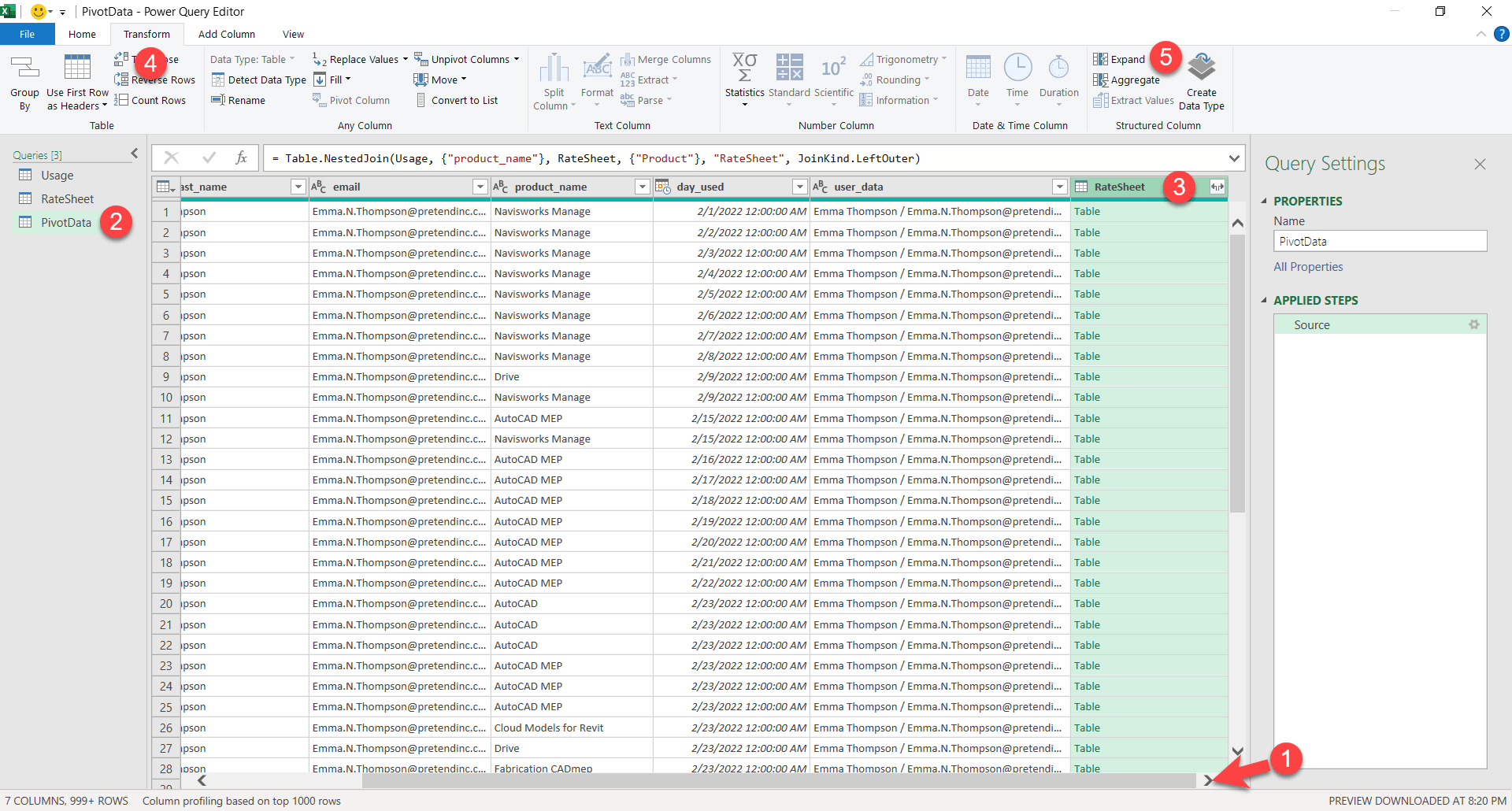
If you scroll to the right (1) you’ll see the new column we added from the merge. On the left, Right-Click on the Merge# query and rename it to PivotData (2) so it’s more meaningful. Next, select the newly added column RateSheet (3). You’ll see that the data in the cells says “Table”. This merged in the entire row into a single table in that column. We want access to that data so it’s expend it by selecting Transform (4) and then Expand (5).
Step 20
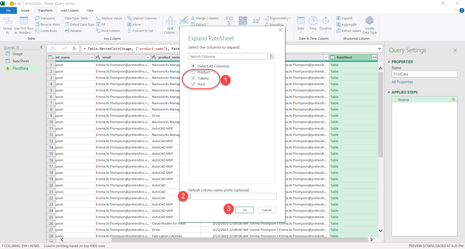
You’ll get a dialog asking which columns you want to expand out of that table. We’ll unselect Product (1) because we already have that in the usage data. We’ll leave Tokens (1) and Price (1). Clear the RateSheet text from the Defsult column name prefix (2) edit box than click OK.
Step 21
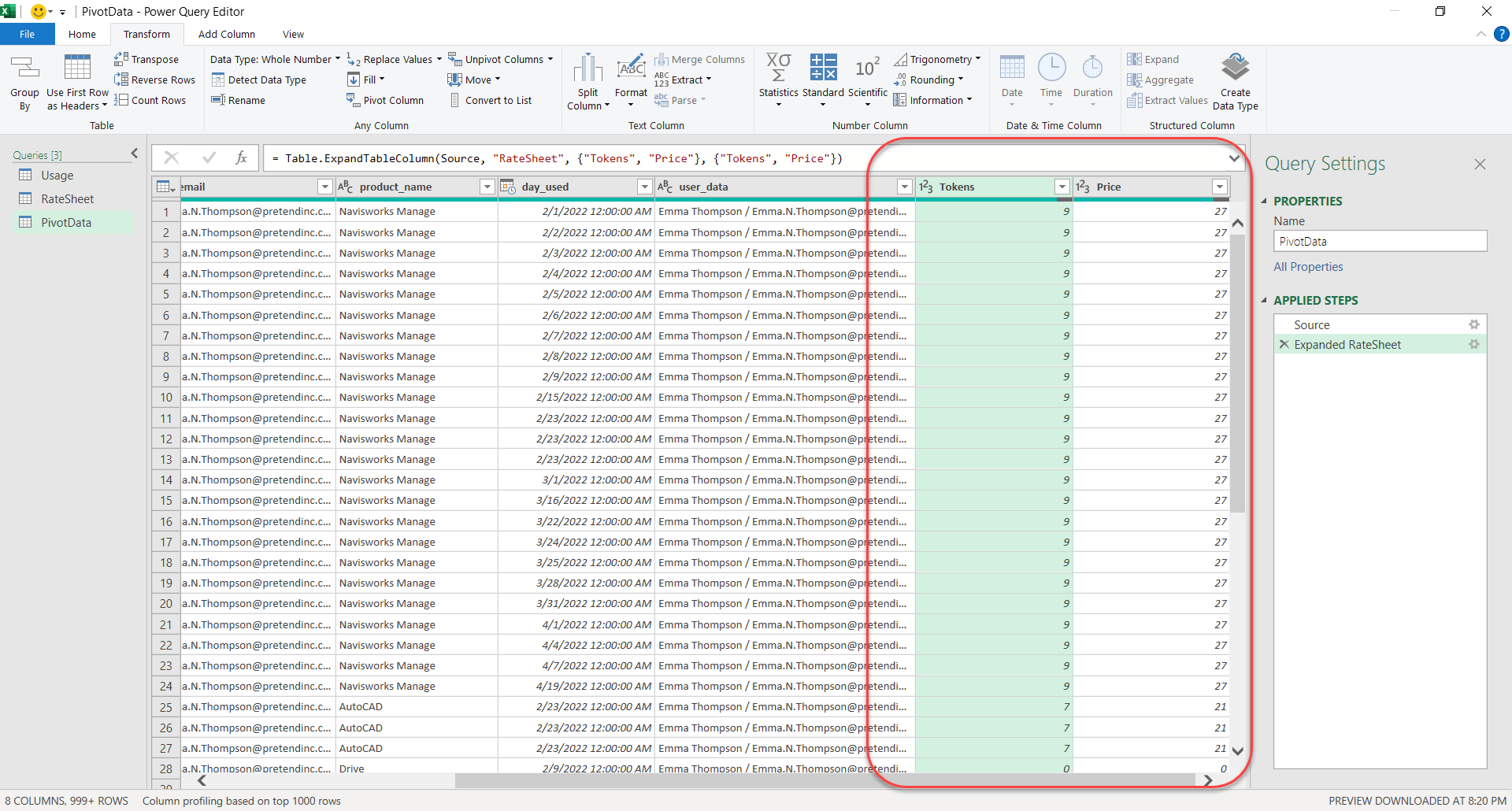
You can now see the Tokens and Price columns added to this query. This really just looked up the value in the product_name column in the Usage query, found the corresponding value on the Product column of the RateSheet query and pulled in it’s Token and Price data.
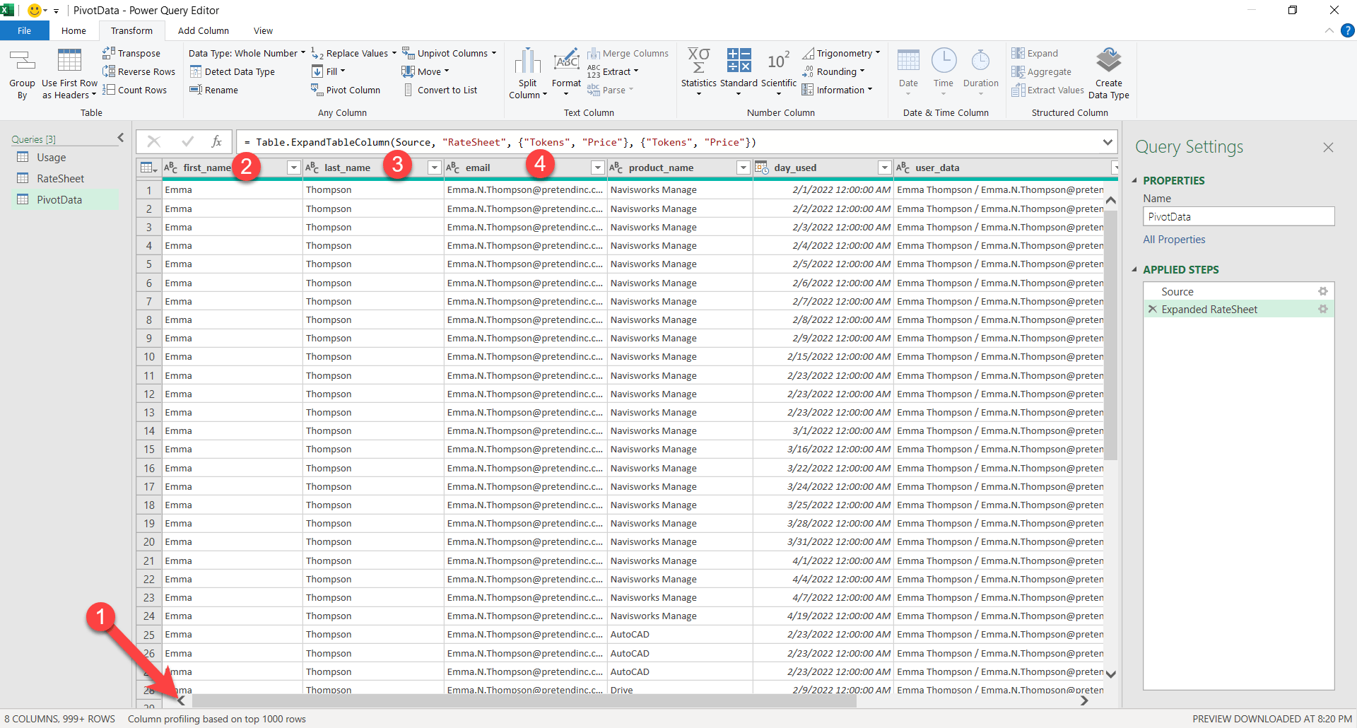
Step 22
Next, we no longer need some of the columns. Scroll to the left (1) and right click on the first_name (2) column and select Remove. Repeat for the last_name and email columns to remove them. This will clean up the data out Pivot table will use.
Step 23
We’re finally done cleaning, filtering and augmenting our data. Let’s click the Home tab (1) and then Close & Load.
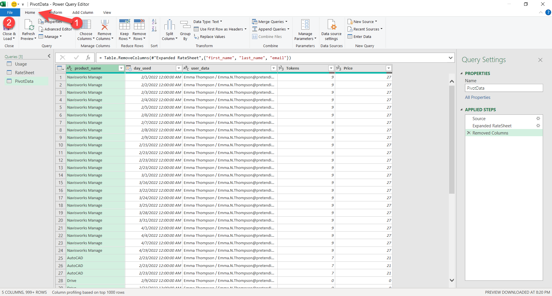
Step 24
We’re now back in Excel and our last two queries were added as separate tabs. You’ll see that we have a tab named RateSheet (no space) and Rate Sheet (with space). The one with the space was our original data we turned into a table. The one without the space is our query of that original. In hind sight, we perhaps could have named it RateQuery to make it more intuitive. You could try to rename it now and see if it breaks your queries. If it does, you could try fixing or deleting and doing them over. Or you could leave it which is what I’ll do.
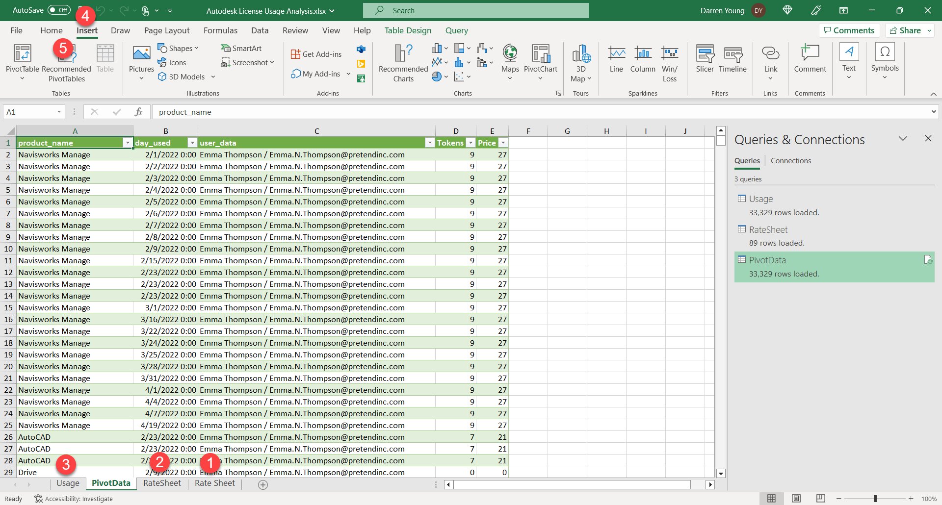
We’ll hide the unneeded tabs by using Right-Click and selecting Hide for the table Rate Sheet (1), RateSheet (2) and Usage (3). Next, we’ll make out Pivot Table be selecting Insert (4) then Recommended Pivot Tables (5).
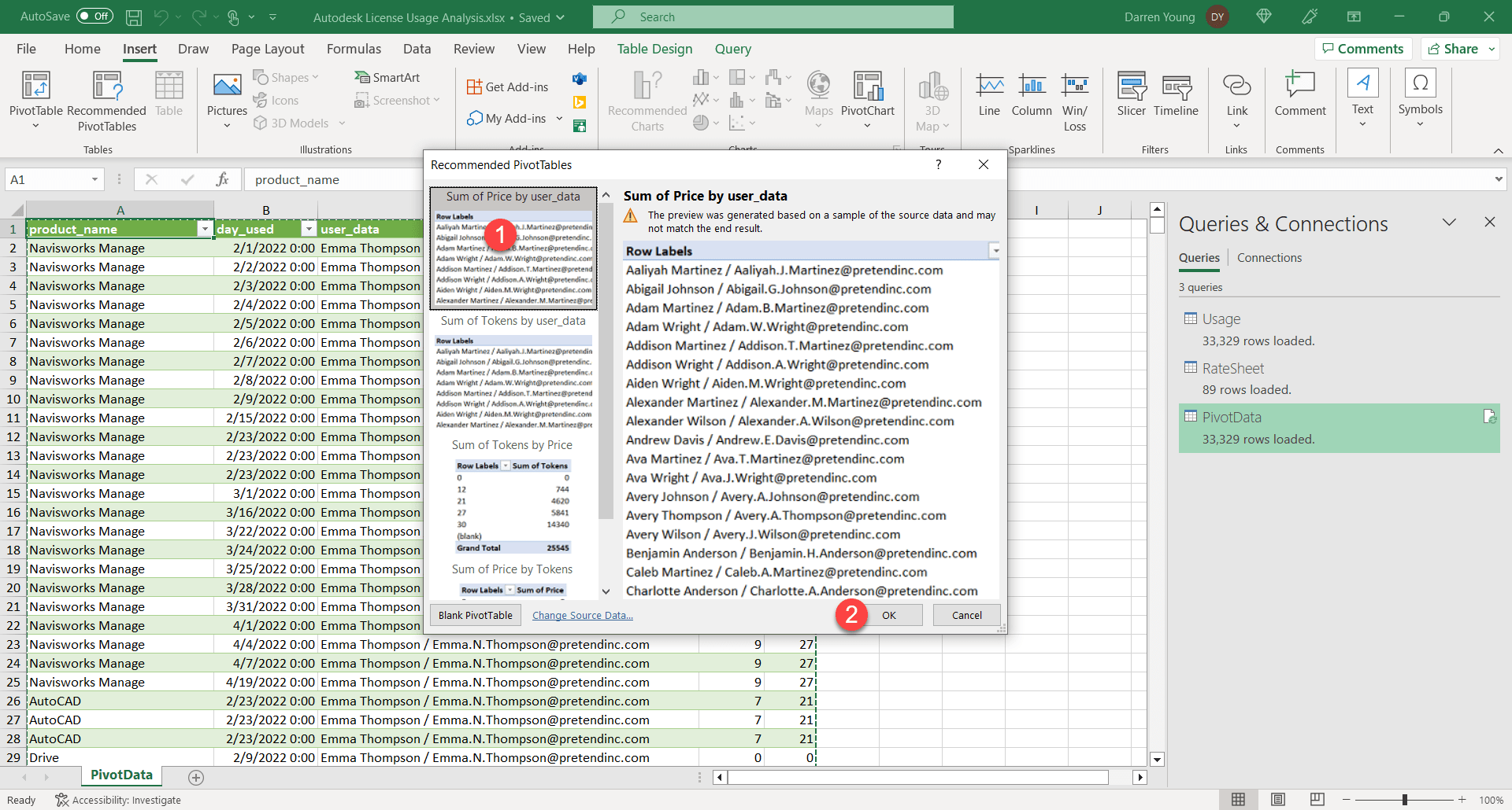
Step 25
In the Recommended Pivot Tables dialog, you can scroll through and pick one that looks close. I rarely do that. Instead I just pick one and worry about modifying it later. Here I pick the first one (1) and then click OK.
Step 26
Here, you can see out beginning Pivot Table. It’s not too far off but we can improve it. For now, we’ll just rename that Sheet1 tab to something more meaningful like Analysis Pivot by right-clicking on the tab and selecting Rename (1).

Step 27
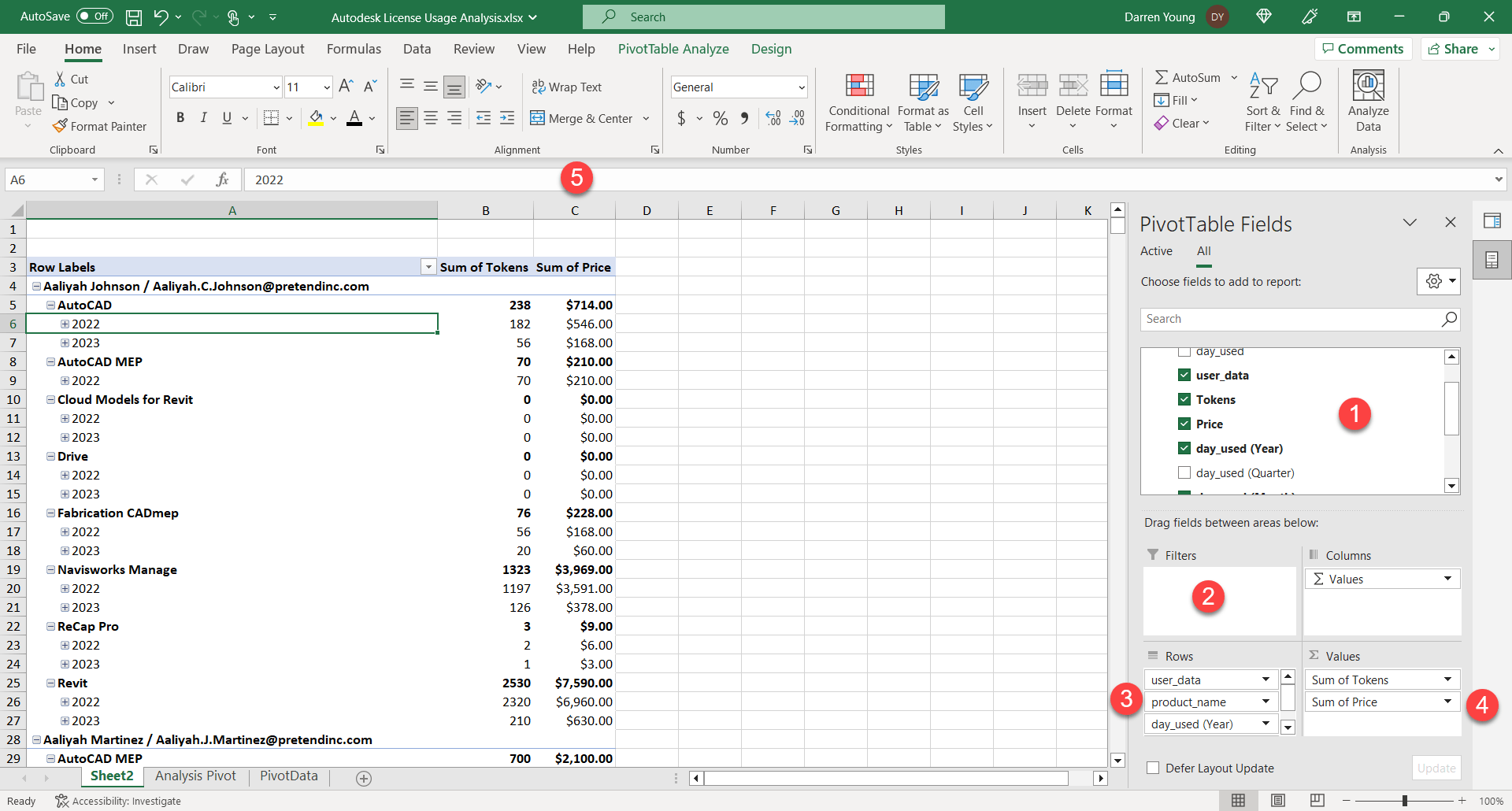
To update the Pivot, just drag fields from the PivotTable Fields section (1) to the Filters (2), Rows (3) and Values (4) sections. If you add to the Filters section, it shows up on the Pivot Table. I tend to leave it blank as I can more easily filter multiple values elsewhere (I’ll show later). I’ve also formatted the entire Price column to display as currency.
The fields I have in Rows are user_data, product_name, days_used (Year) and days_used (Month). Note that in our Pivot data we only had a date field. Excel automatically adds multiple fields to help you group dates. If this doesn’t happen, remove ALL the date fields from the Rows section and re-add the days_used, You should get multiple fields added. I typically remove the Quarter and Day.
For the Values column, I’ve added Tokens and Price. Once I get all the fields I want, I then do a little work on formatting. For starters, I make Column C/Price (5) formatted as Currency.
Step 28
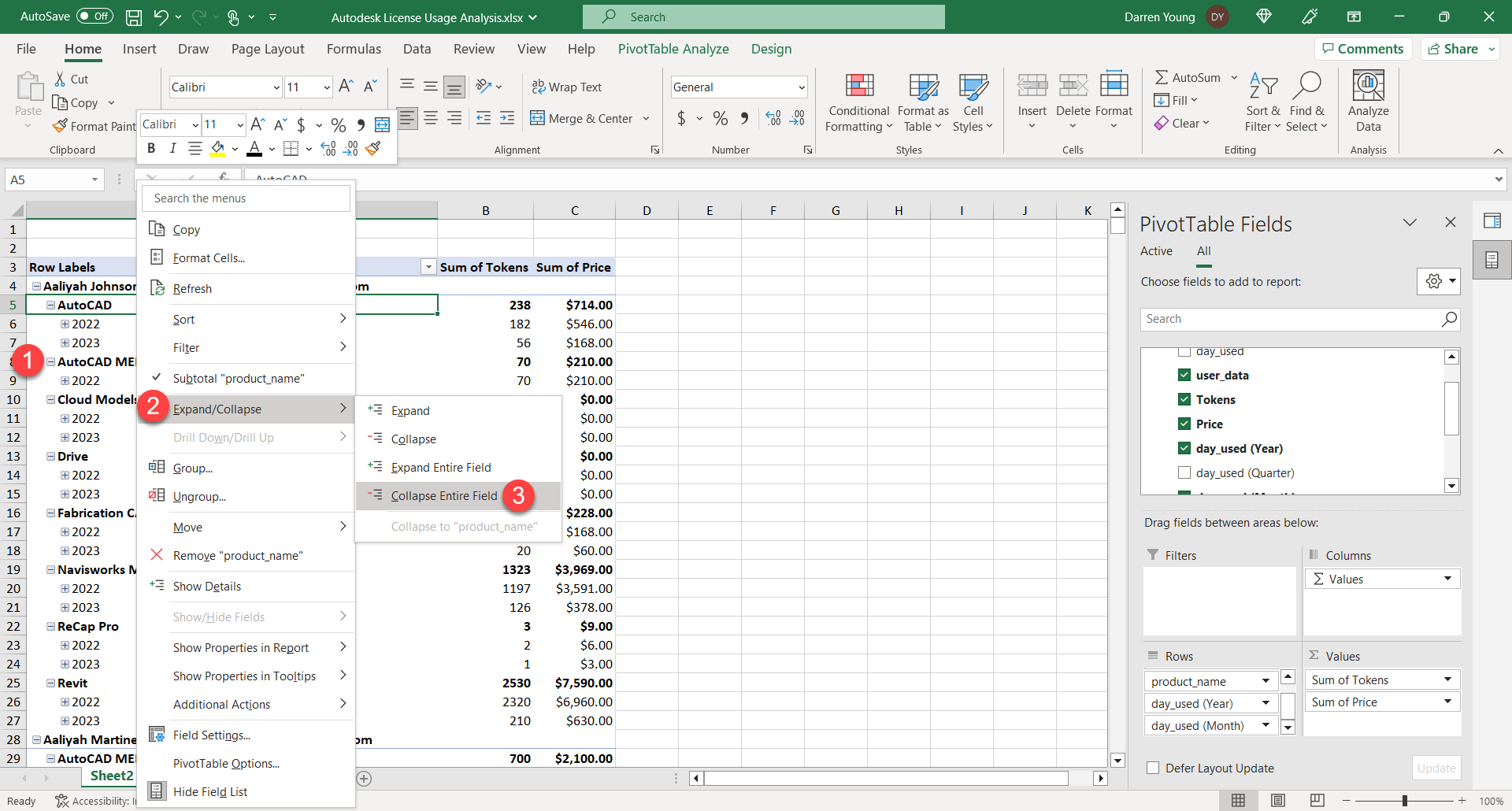
Next, lets Right-Click on the product name data (1) in the Pivot Table and select Expand/Collapse (2) then Collapse Entire Field. This collapses everything down to the Product level.
Step 29
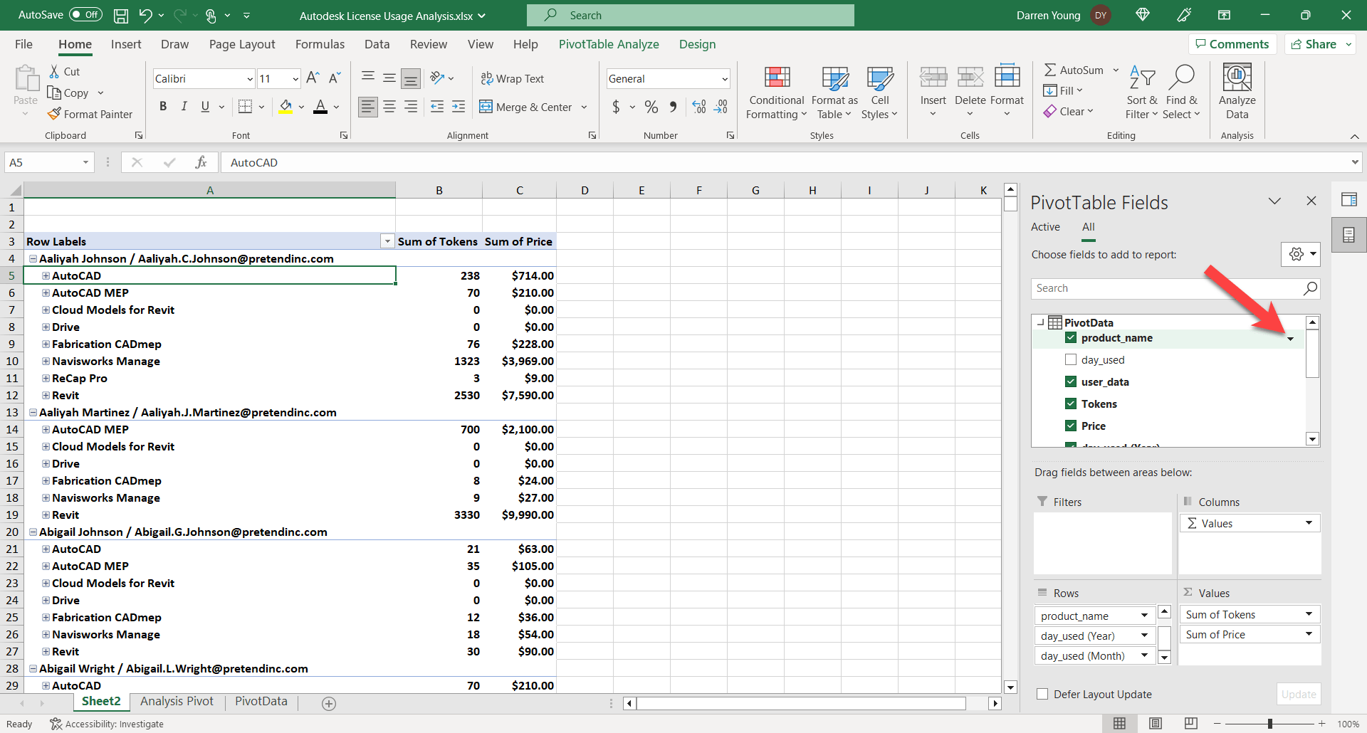
Remember when I said I prefer to filter a different way? Here, I can filter the products I want in my Pivot. Products that don’t use Tokens and aren’t in the Rate Sheet don’t appear (in case you were wondering). We’re not concerned with that. If they aren’t available with Flex licensing, there’s no need for analysis.
But if you look at the following image, you can when you hover over the product_name field there’s a little down facing triangle. Click on that to get to our filtering.
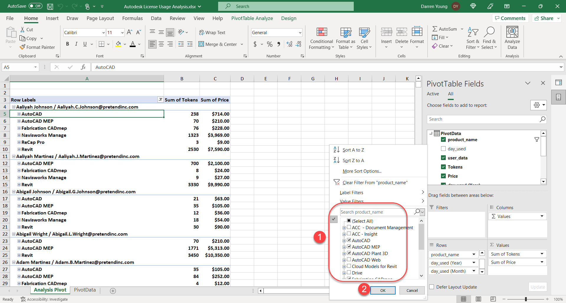
Step 30
In the filter dialog, I’m going to shut off all products (1) that are not in the AEC Collection as well as any product that uses zero tokens (see your token rate sheet). The remaining product I have (yours will be different) are AutoCAD, AutoCAD MEP, AutoCAD Plant 3D, Fabrication CADmep, Navisworks Manage, Recap Pro and Revit. You could leave on the zero token products if you like, I just didn’t want to type them all here! Once done, click OK (2).
Step 31
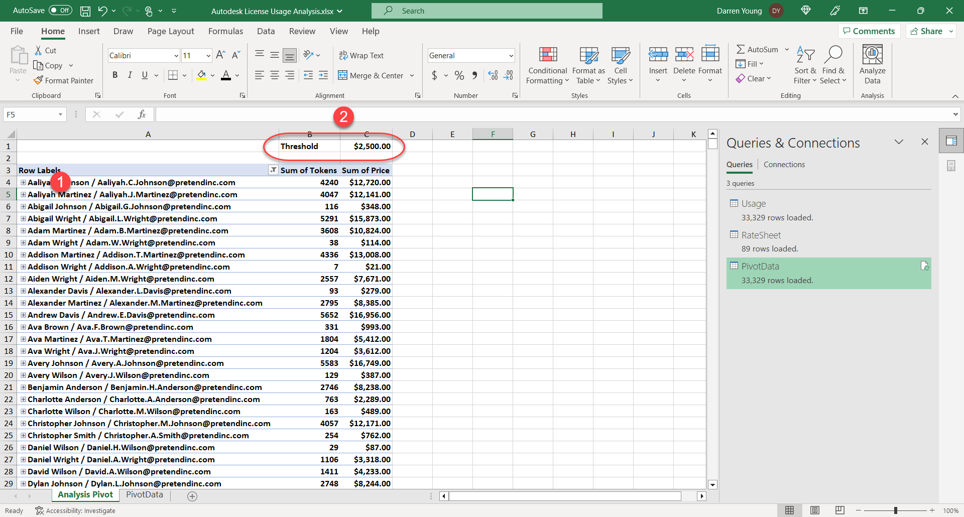
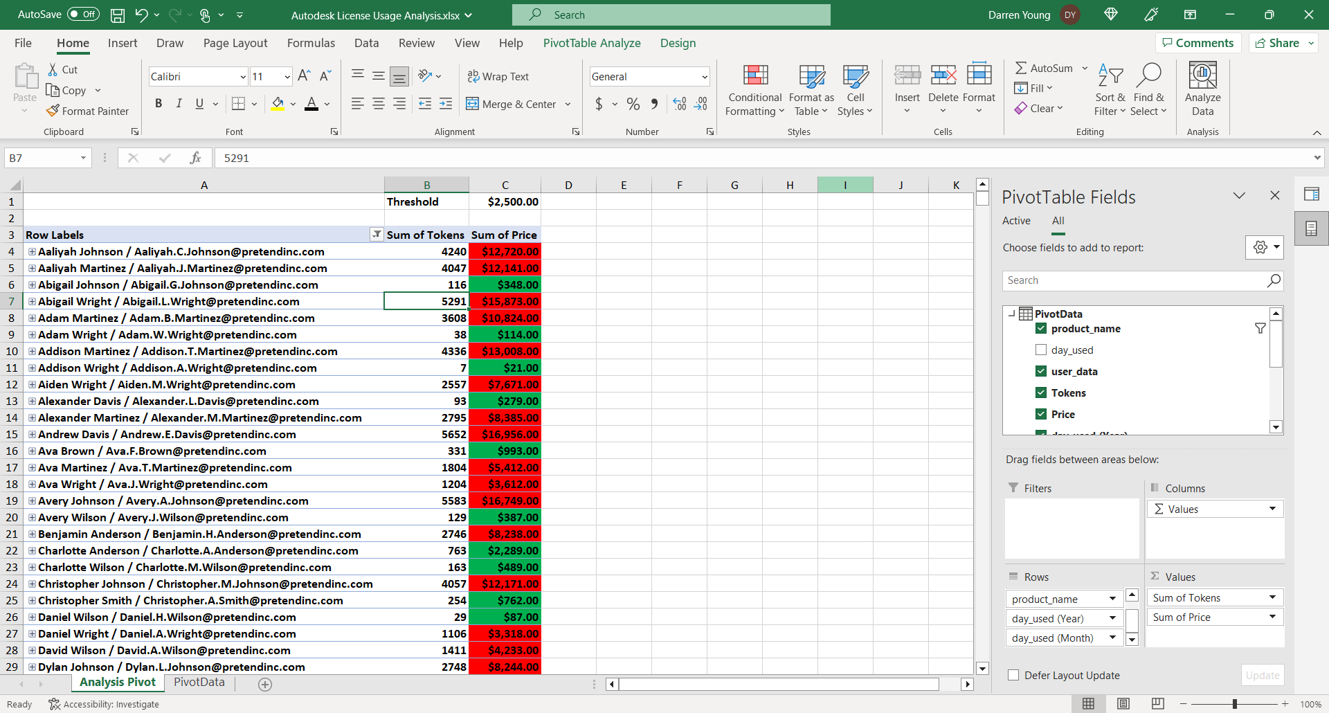
Next, I collapse all the data in the Pivot Table down to the user level (1). This was shown earlier in Step 28. At this point, you see the yearly total for all users in terms of both Tokens Used and the Price you would have paid if those users were theoretically on the Flex licensing model over the last year.
As you can see, Flex is a much more expensive licensing model for users who would be full time. The cost in the US for a full AEC Collection license is about $3000 annually. So anybody under that price would have been cheaper on Flex…maybe. Remember that “2 for 1” Network trade in Autodesk did? Those license are discounted significantly. Those discounted prices nee to be taken into consideration too. You may have users cheaper on Flex if they had a full dost license, but not if they were using a discounted license.
To help me run these scenarios, I add a Threshold price at the top (2) that I can plug a target number I’m looking to compare against. A new AEC Collection is $3000 so I build in a safety margin and use $2500 as my number. Anyone under $2500 I move to Flex. But I can also put in $1200 and see how somebody would compare to a discounted license.
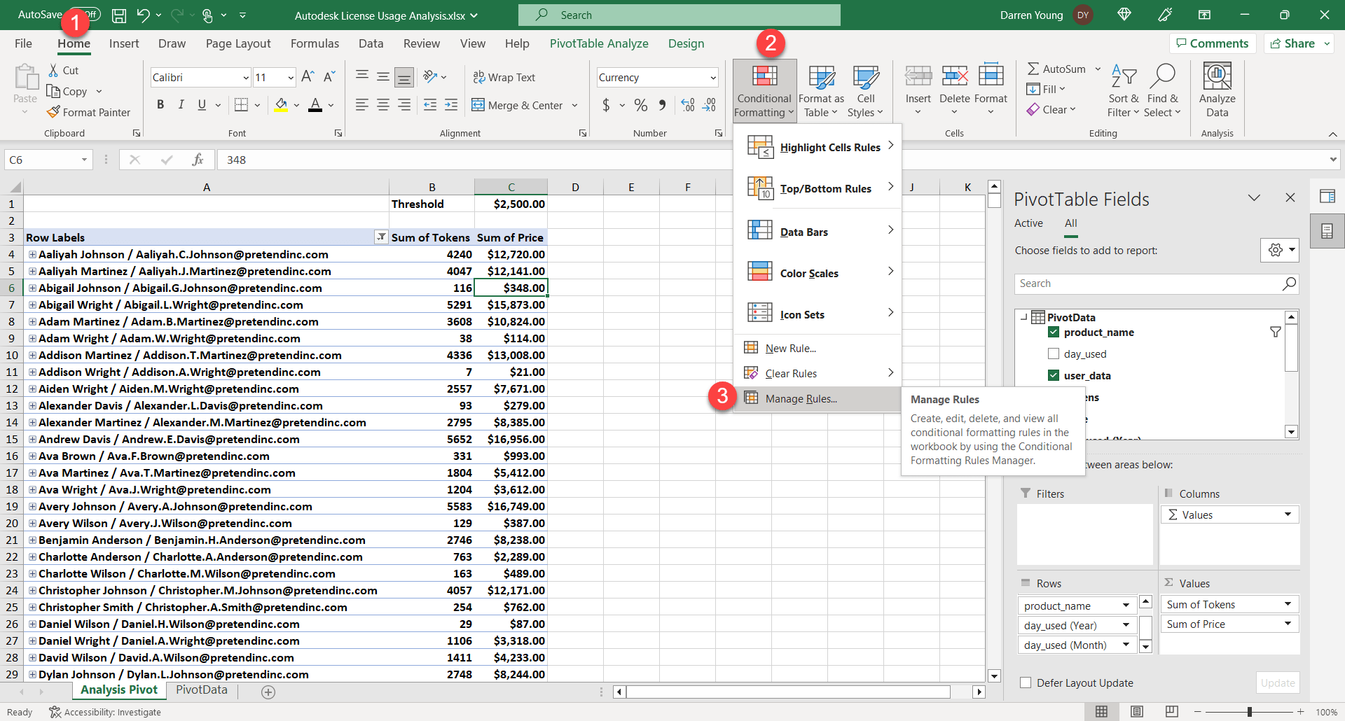
Step 32
The last little “nice” thing I do that’s not required uses the threshold number I entered earlier. I then use Conditional formatting to color the values to more easily see what should and should not got to Flex.
Select Home (1), Conditional Formatting (2) then Manage Rules…(3)
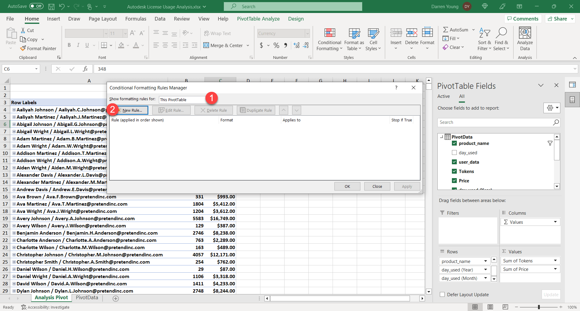
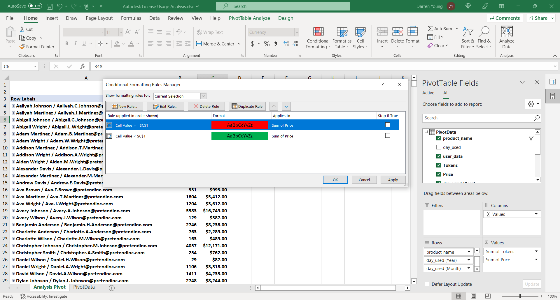
Step 33
In the Conditional Formatting Rule Manager dialog, make sure This PivotTable (1) is selected from the dropdown and then click New Rule (2).
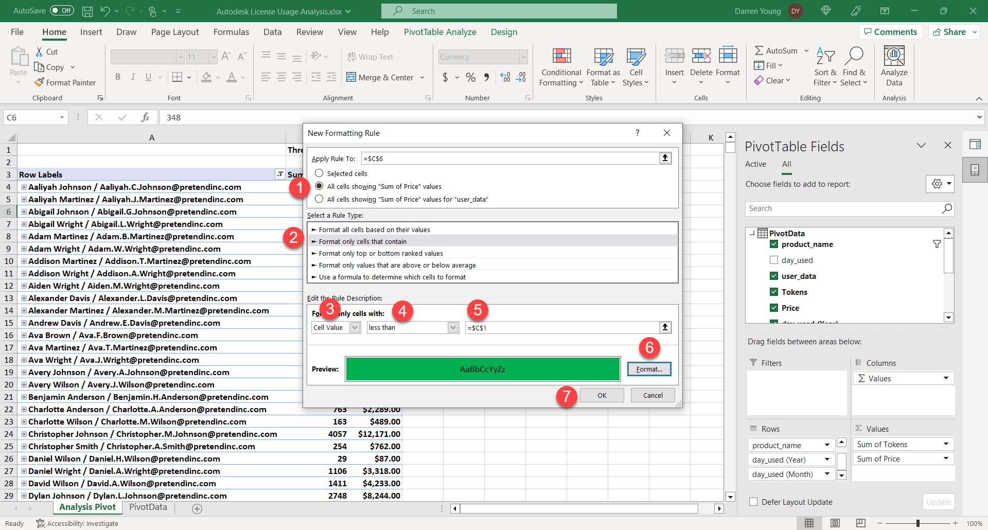
Step 34
In the New Formatting Rule dialog, select All cells showing ‘Sum of Price’ values (1), then Format only cells that contain (2), next set Cell Value (3) to Less than (4) for the cell =$C$1 (5) which is where you place the Threshold value you want to use. You can then change the Format (6) to Green and click OK (7). This will highlight all cells below your Threshold value indicating they’re likely Safe to move to a Flex license.
Repeat Step 33 and 34 to make another rule but change it to Greater than or Equal to (4) and the Format(6) to Red then click OK.
Step 35
When you’re done, your rules should look like this. Click OK.
Step 36
You’re done! Your data should look like this. You can now play with Filters, the Threshold dollar amount you want to use as your reference. You can even expand in and drill into each users data. Play with the Pivot Table values and experiment to get the data how you want.
Summary
Hopefully this was helpful. I was able to save over 30% on my Autodesk renewal this year by analyzing license usage by performing the following…
- Check which users can switch to Flex.
- Count dedicated license users who can’t move to Flex.
- Buy 75% of the tokens needed for the Flex users.
- Drop unneeded full cost product licenses.
- Retained unneeded discounted licenses
- Eliminated products completely if Flex covered all user needs
I kept extra discounted licenses from the 2-for-1 trade-in, which offer deep discounts till 2028. It’s hard to find discounts, let alone multi-year ones, so I believe these will cover future full-time user growth.
Some other companies I spoke with have also reduced their desktop software licenses by almost 1/3, using Flex for part-time users.
To run analysis using new data, just overwrite the report with the new data in the same format. Then, open your analysis spreadsheet and refresh all queries and pivots. I hope this helped you save and learn some Excel Power Query! Good luck!